site:(u-bordeaux.fr OR cnrs.fr OR inserm.fr) filetype:pptxCommunicate your research
Creating effective slides
Eric Largy 
ARNA, INSERM U1212, CNRS UMR 5320, Université de Bordeaux
UFR des Sciences Pharmaceutiques, Université de Bordeaux
April 20, 2026
Random slides
Low quality and trustworthiness
Get rid of the noise ![]()
- Have messages
- Adapt to your audience
You ⤳ Audience
This is a very long text block, which is not very effective to communicate a message. It is better to have a few words on the slide and explain them verbally. If you have too much text, people will stop looking at it and will not understand the message. It is therefore useless to have a lot of text on the slide, as it will not be read and will not help to communicate the message. Eventually, it will even detract from the message, as it will be a distraction for the audience. If you have read this far, you have probably not been listening to what I am saying, which is not good communication on my part. You may think that you need to have a lot of text on the slide to be able to explain it, but this is not the case. You can have a few words on the slide and explain them verbally, which will be much more effective to communicate the message. You should know what you are talking about and do not need notes on the slide to explain it. The slide is not for you, it is for the audience. Having text in bold does not make it better if its embedded in a text block or long sentence.
Get rid of the noise ![]()
- Have messages
- Adapt to your audience
- Maximise the signal/noise ratio
You ➨ Audience
Get rid of:
- Too much text
- Too small text
Get rid of the noise ![]()
- Have messages
- Adapt to your audience
- Maximise the signal/noise ratio
You ➨ Audience
Get rid of:
- Too much text
- Too small text
- Background colors
Slides are not the presentation
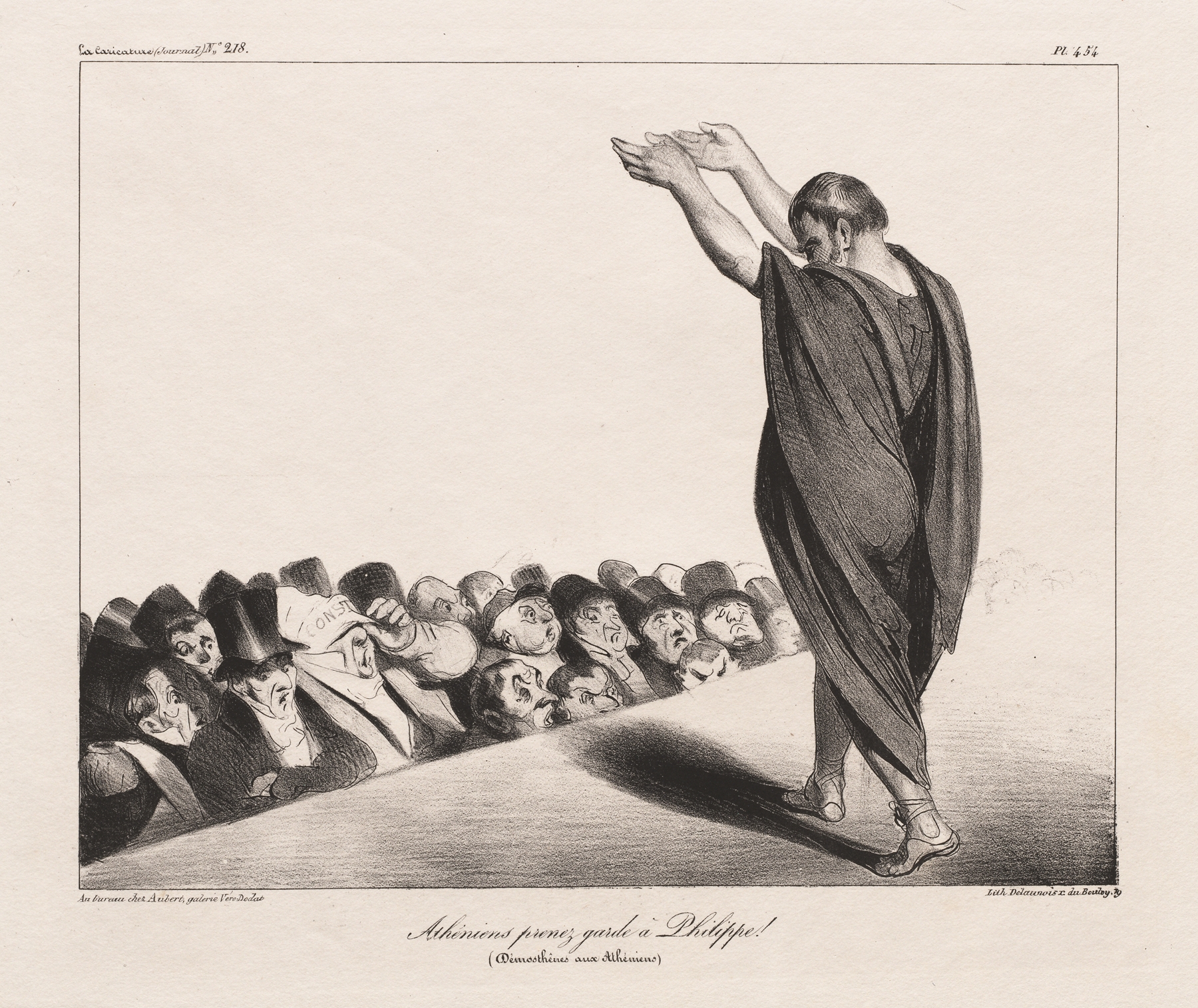
Honoré Daumier, 1835
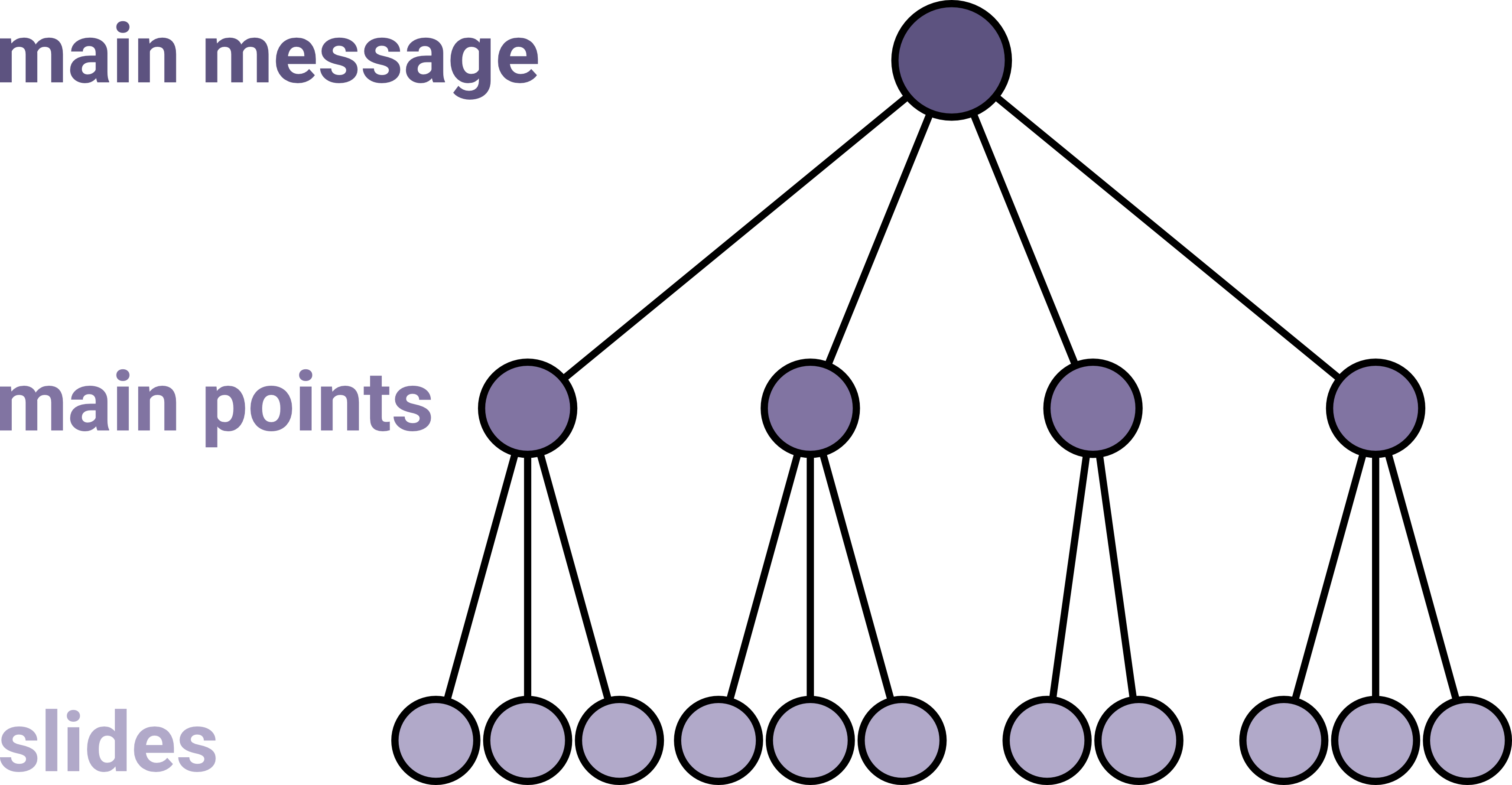
Convey each subpoint of your message with a slide
Use the title to state your message
Audiences read titles
Use the title to state your message
Structure related
Not informative
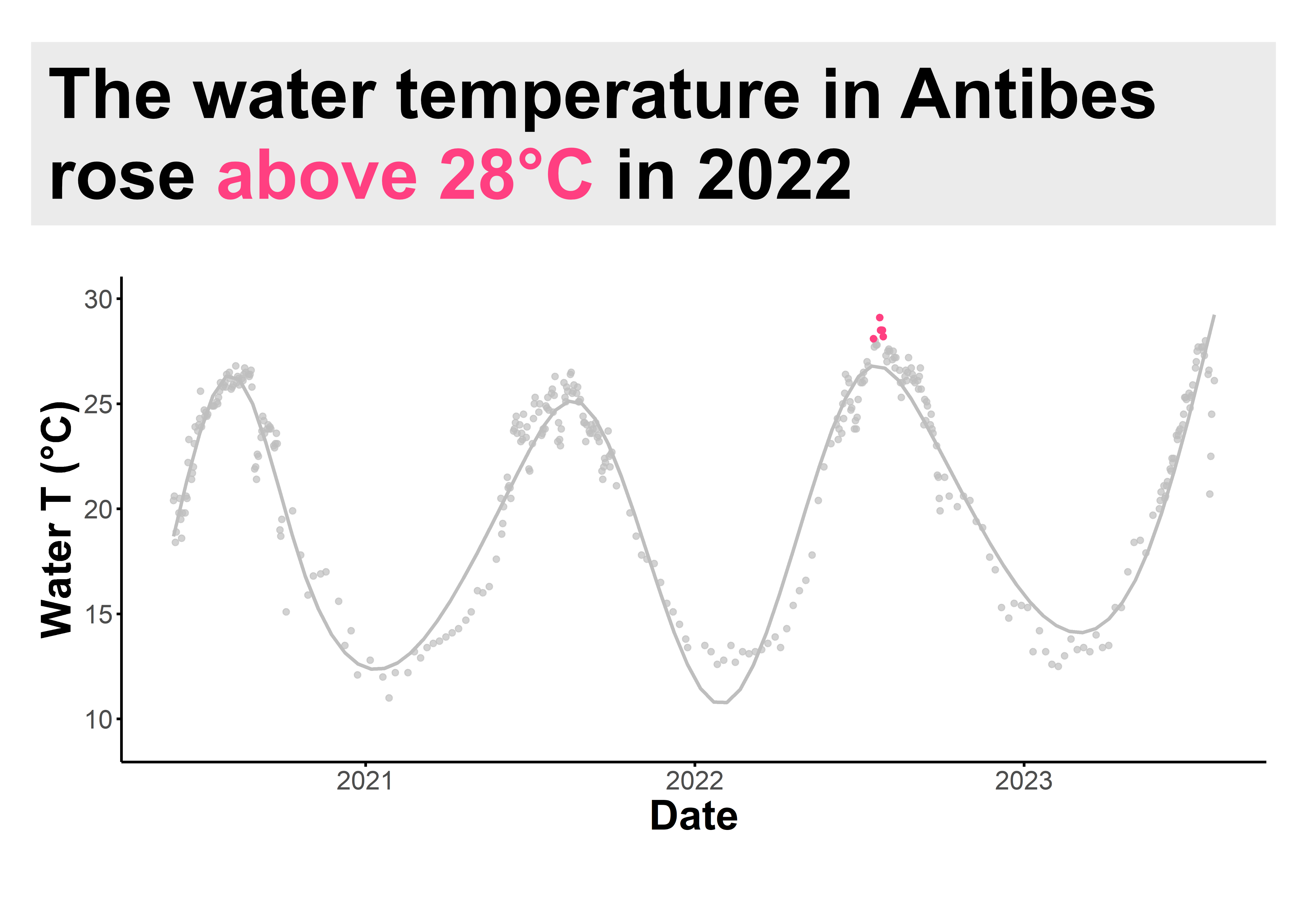
Use the title to state your message
What?
Inneffective redundancy
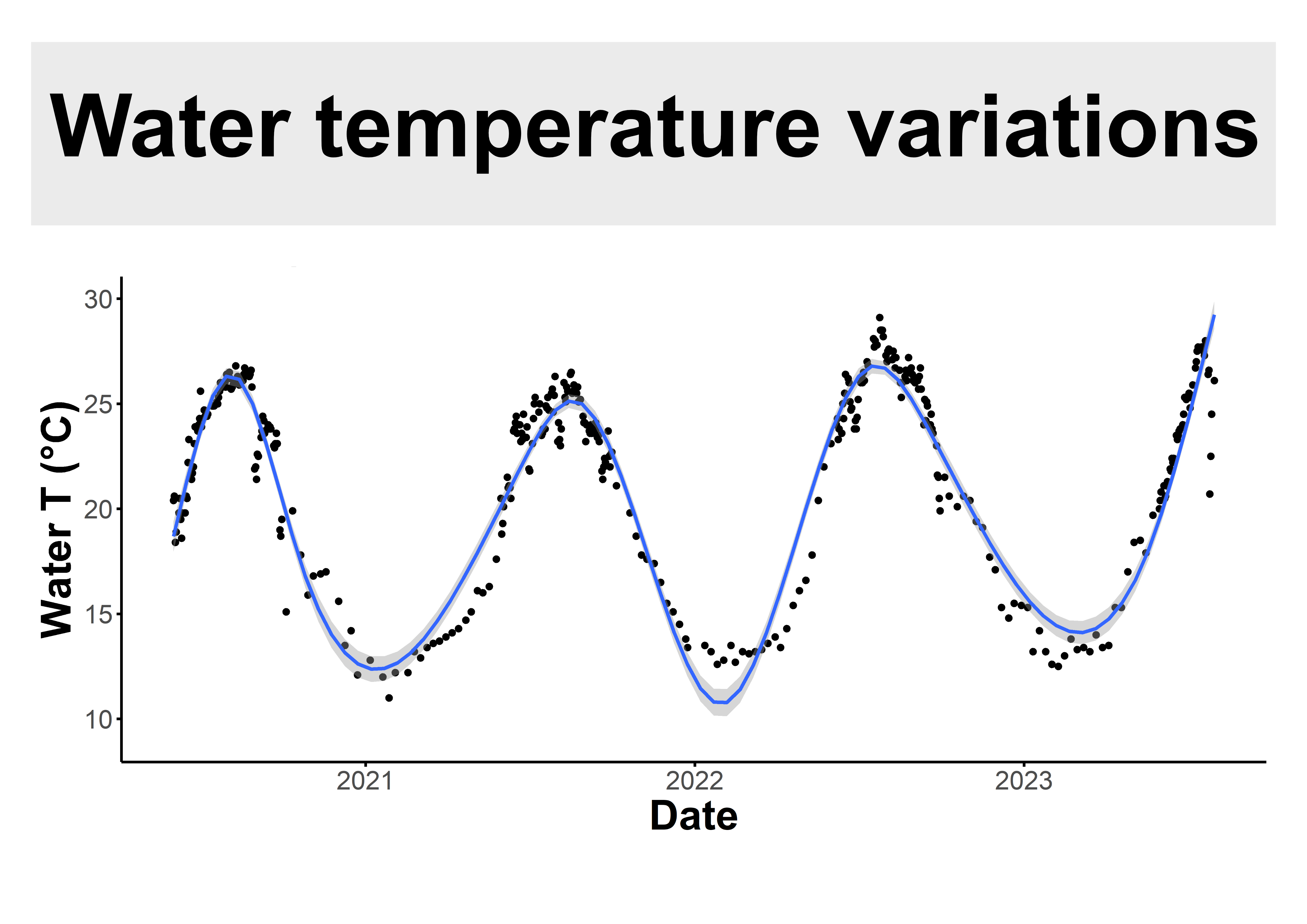
Use the title to state your message
So what?
Gets the message across
Maximize the Signal/Noise ratio
Maximize the Signal/Noise ratio
Maximize the Signal/Noise ratio
Maximize the Signal/Noise ratio
Tie your speech visually to the slide
Tie your speech visually to the slide
Include the logo in your Q&A slide
![]()
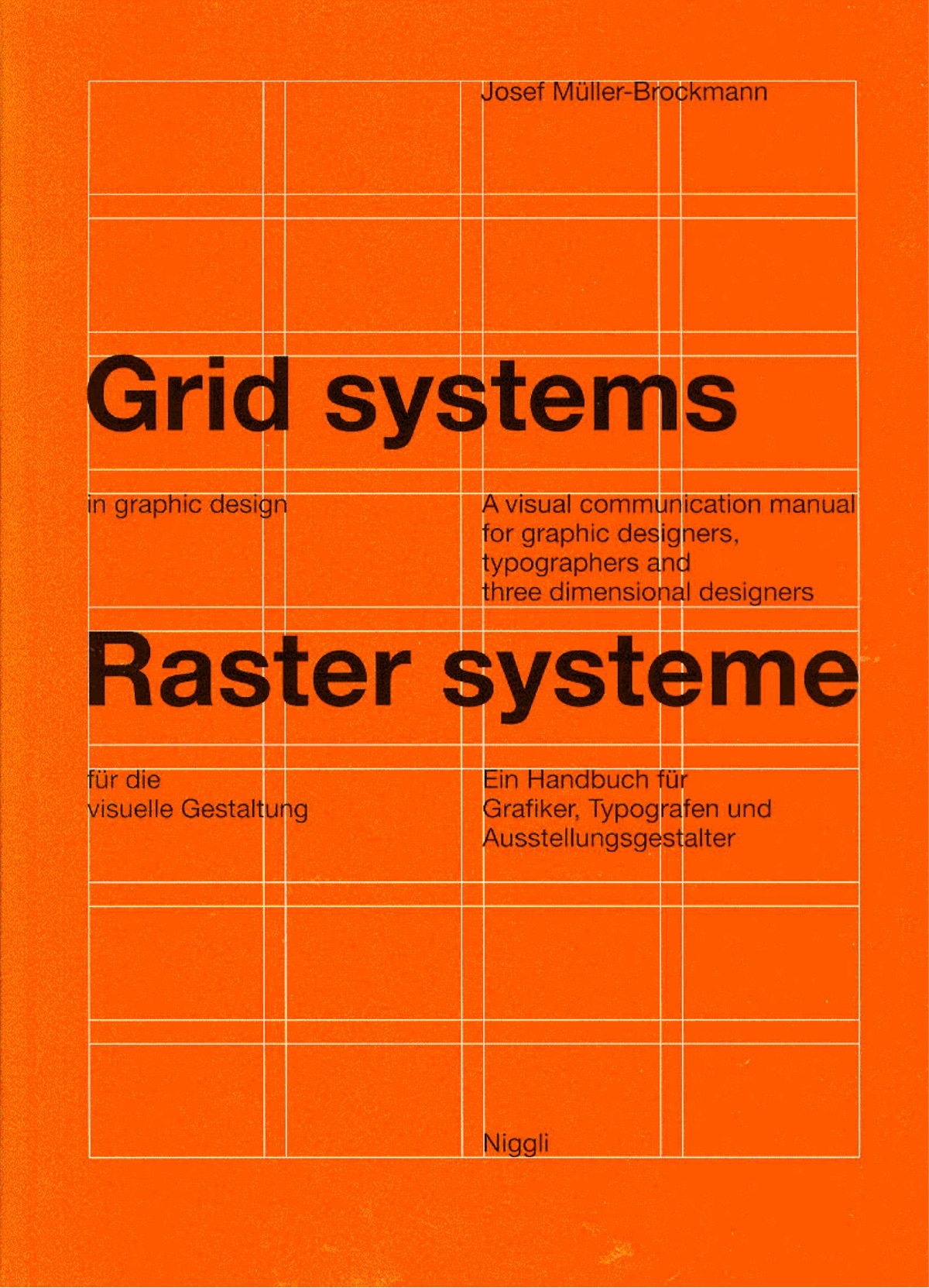
The International Typographic Style
is clear, simple and functional
Key core principles translate into effective slide design
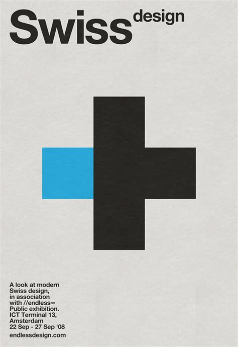
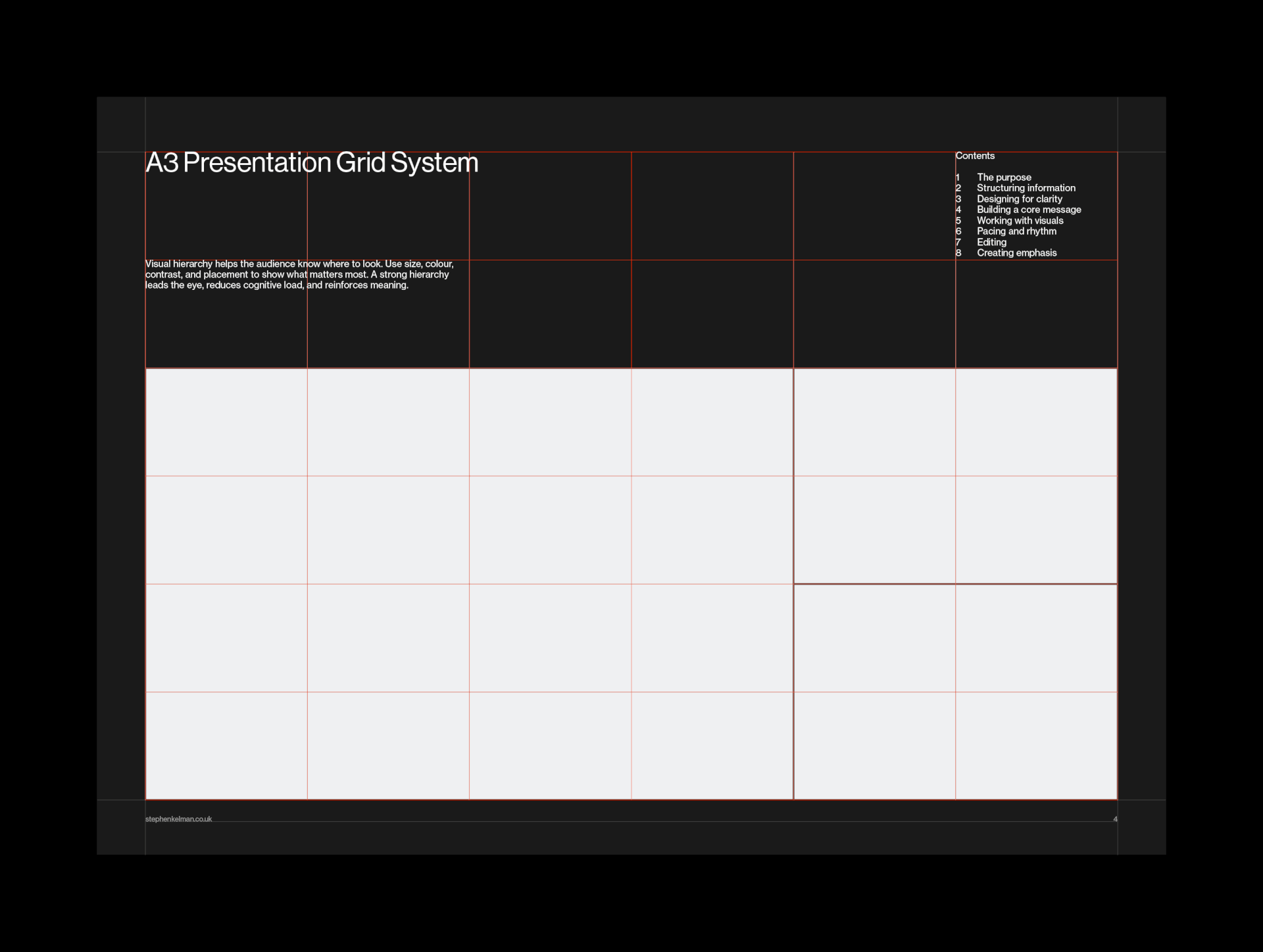
Align, align, align
- Left-align your text
- Clean, organized look
- Avoid centering and justification
- Use a modular grid
- Consistent spacing and alignment
- Visual harmony, professionalism
Align, align, align
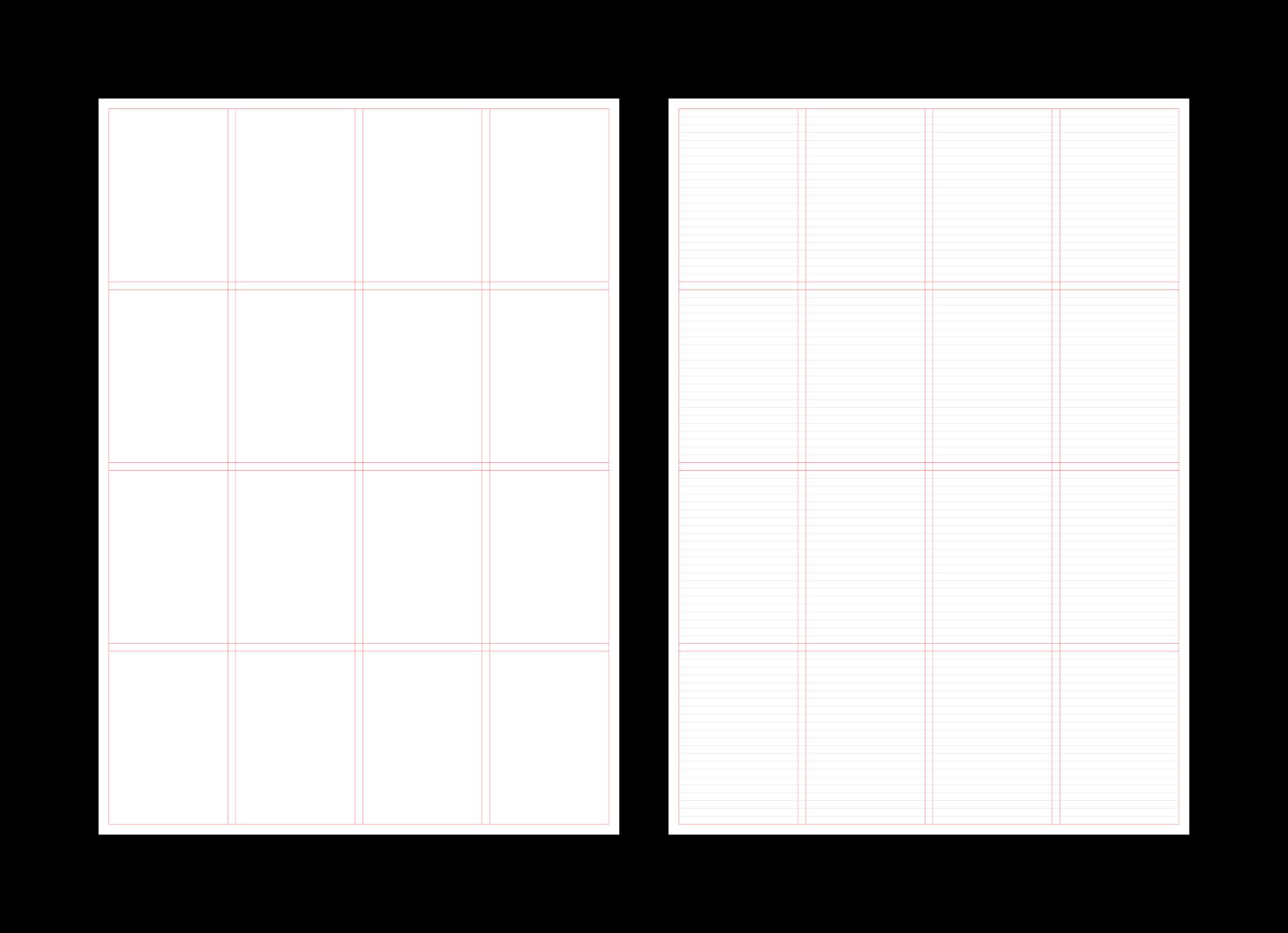
Align, align, align
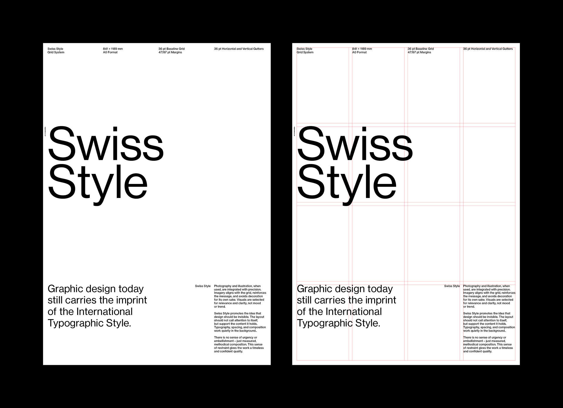
Align, align, align
Use negative space
- Use white space generously
- Prevents noise
- Draws attention to key content
- Less is more
- Let the content breathe
- Improves readability
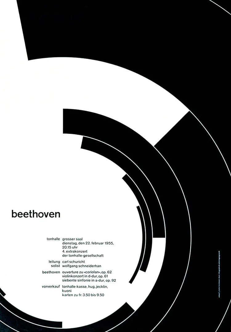
Use asymmetry
- Creates dynamic and engaging layouts
- Keep it grid-aligned!

Use sensible typography
- Distinctive fonts are fine
- Goofy are not
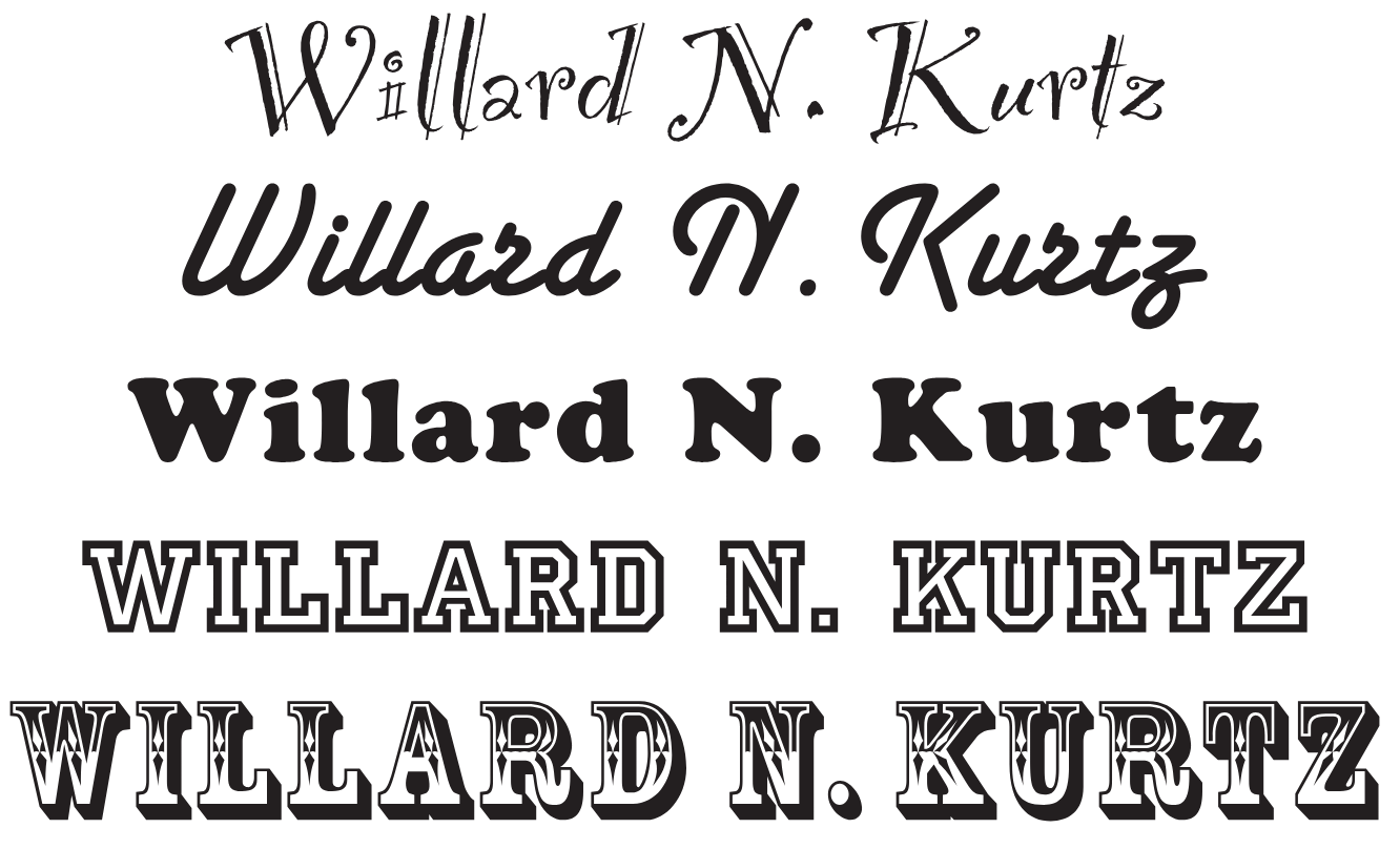
Use sensible typography
- Distinctive fonts are fine
- Goofy are not
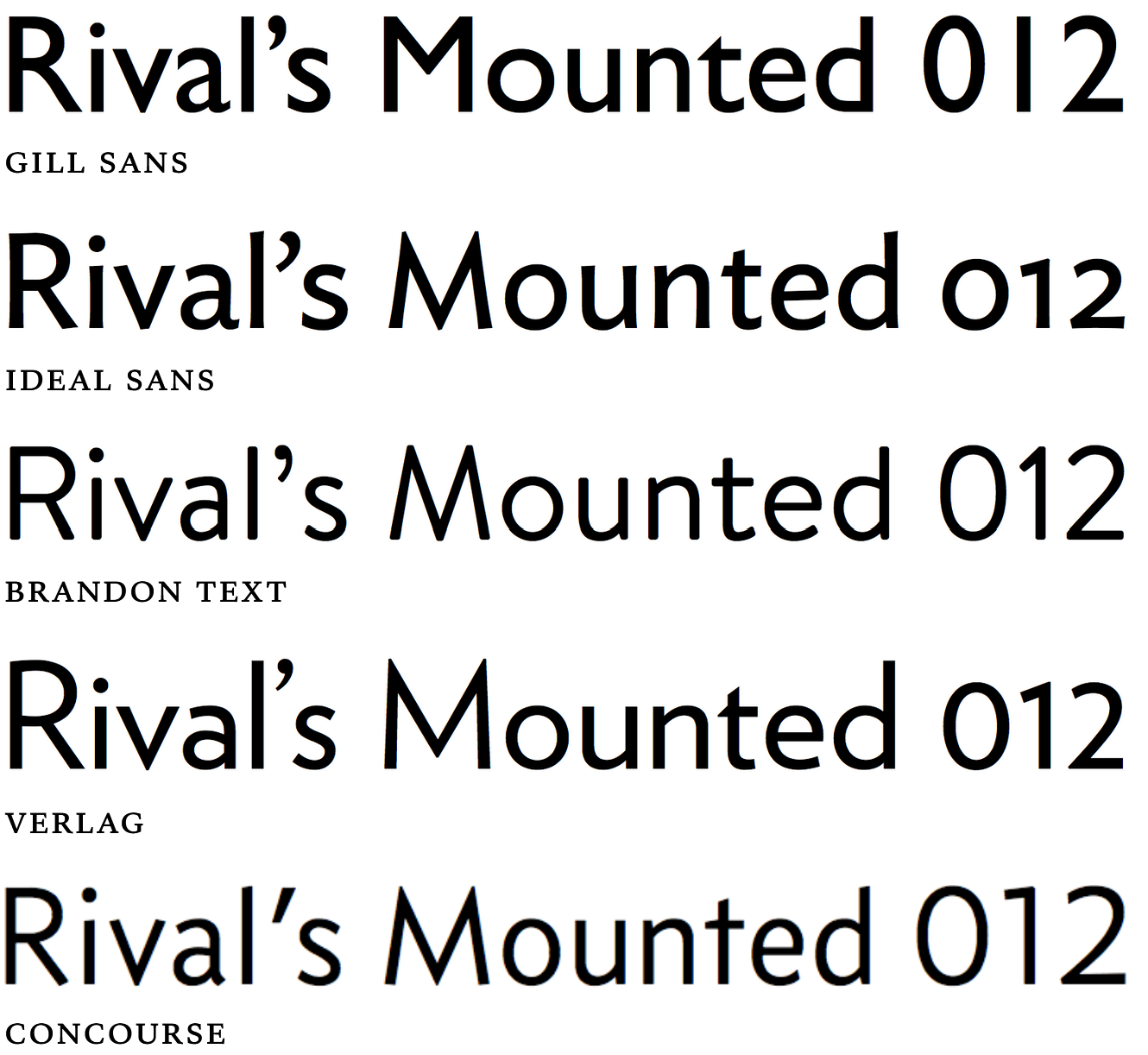
- Use sans-serif fonts
- Clean, neutral, highly legible
Use sensible typography
- Distinctive fonts are fine
- Goofy are not
- Use sans-serif fonts
- Clean, neutral, highly legible
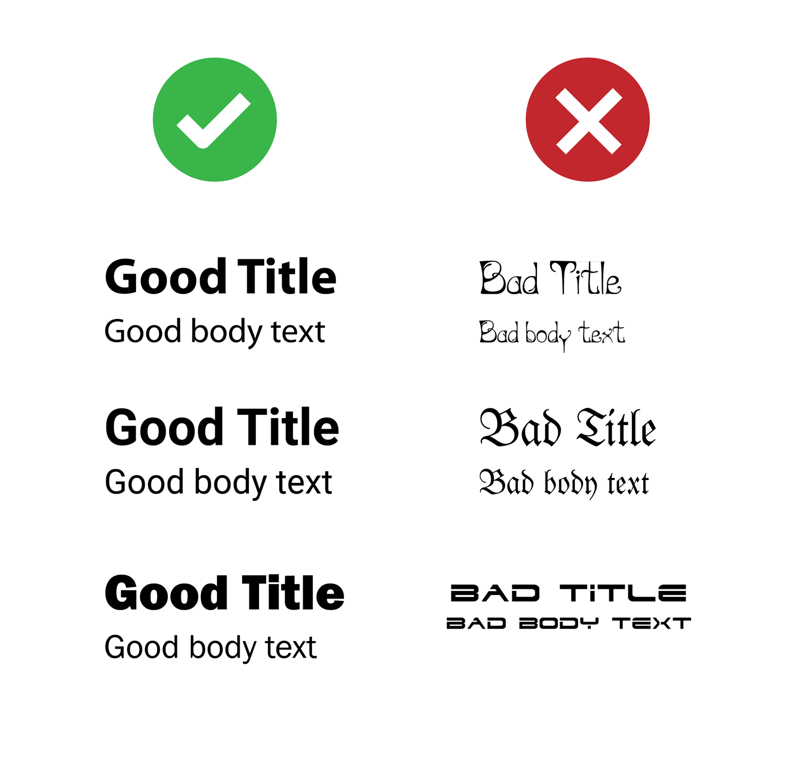
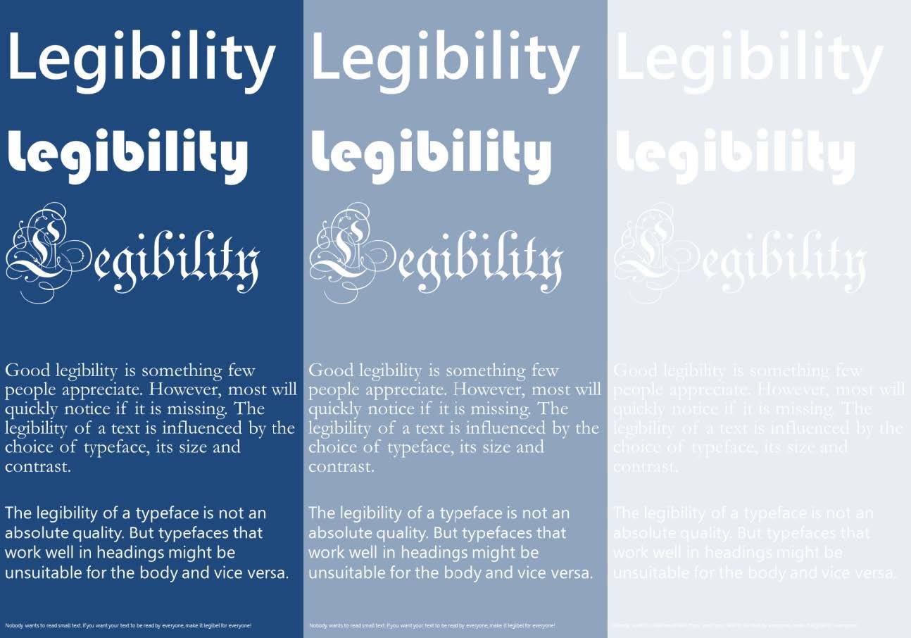
Be legible
Use colors as if you’d need to pay for it
- Avoid gradients or overly bright colors
- Distracting, hard to read

François Morellet, Centre Pompidou
Use colors as if you’d need to pay for it
- Avoid gradients or overly bright colors
- Distracting, hard to read
- Minimalist color palettes
- Neutral base (black, white, gray)
- 1 or 2 accent colors for emphasis
Use contrast only to highlight
key information
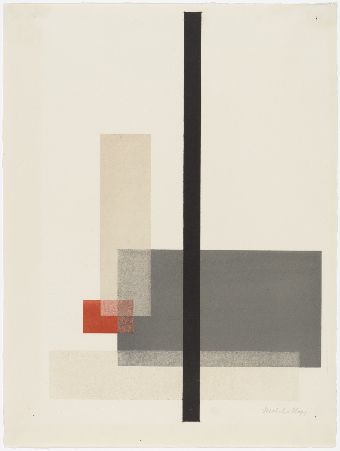
László Moholy-Nagy, Centre Pompidou
No grayscale compatibility may cause issues
for color blind people.
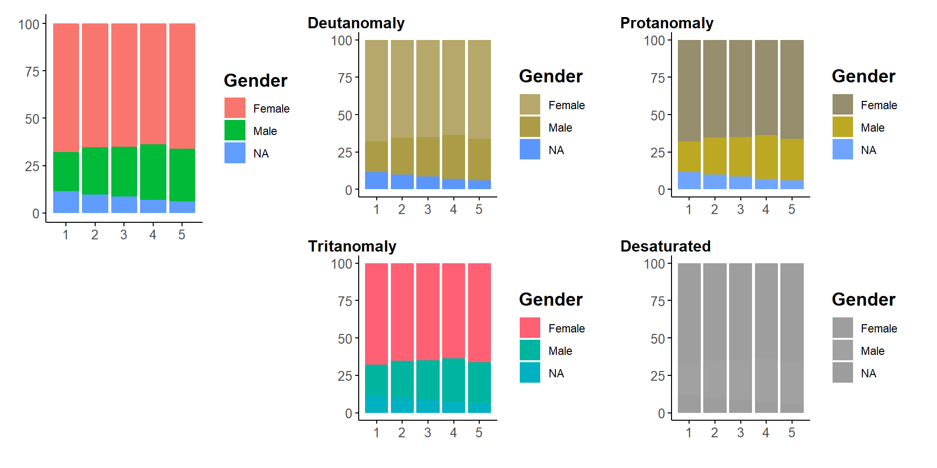
Culturally ingrained choices are often poor
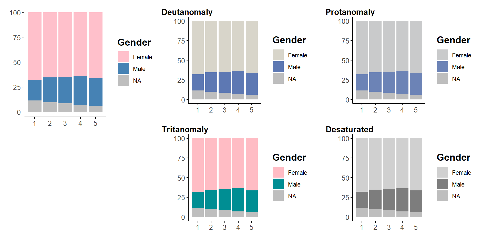
Okabe Ito is good choice for colorblindness
but not grayscale
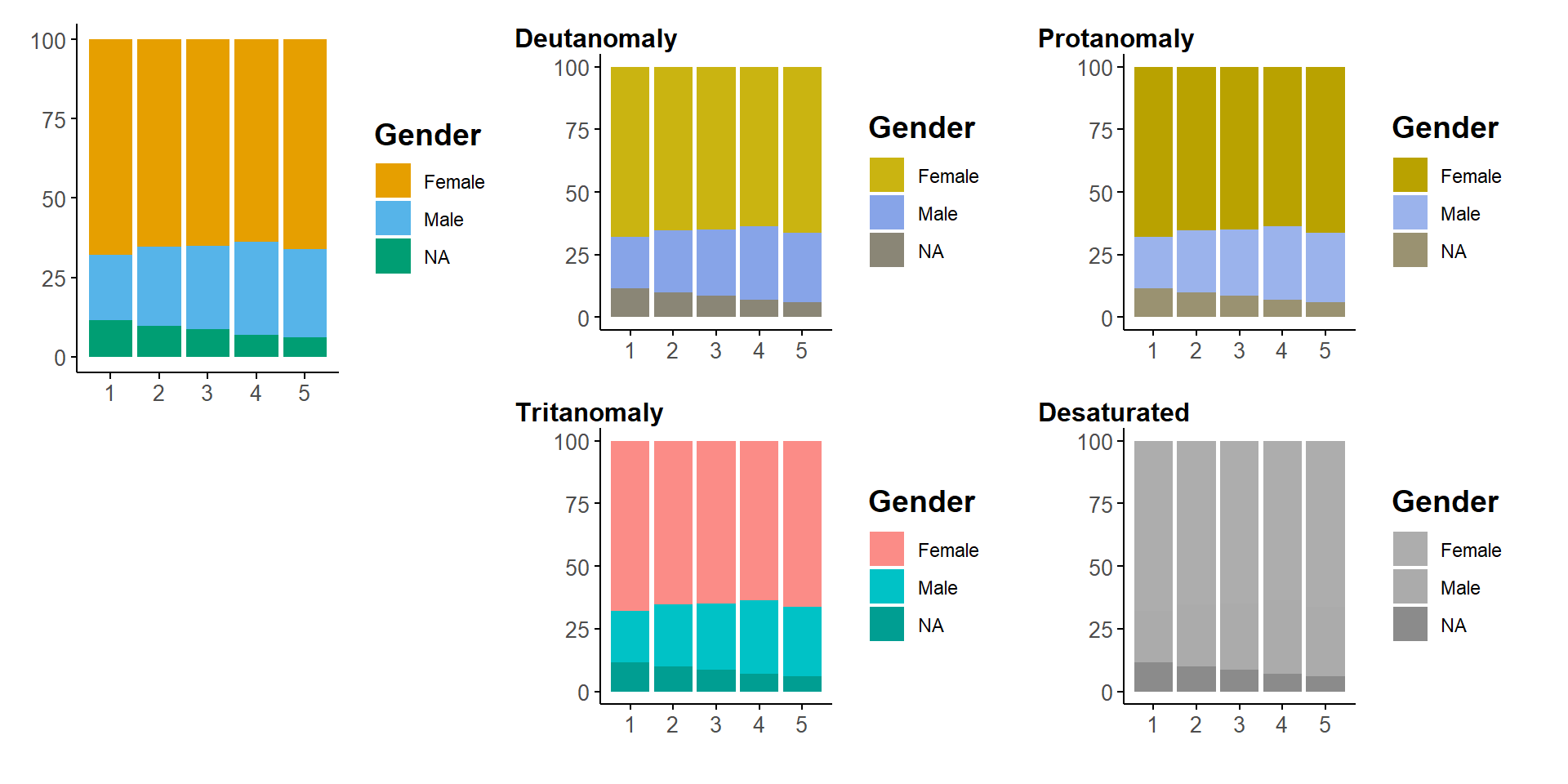
Viridis is always good choices
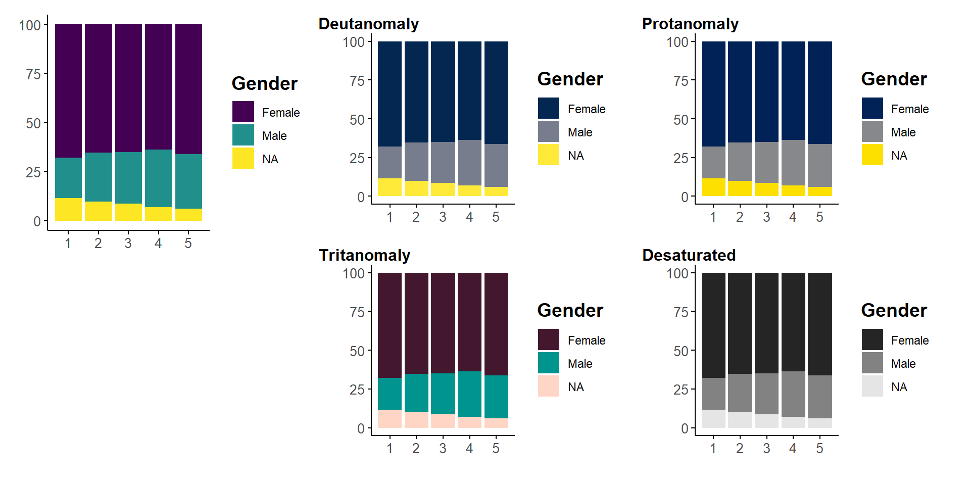
Cividis is an example of alternative
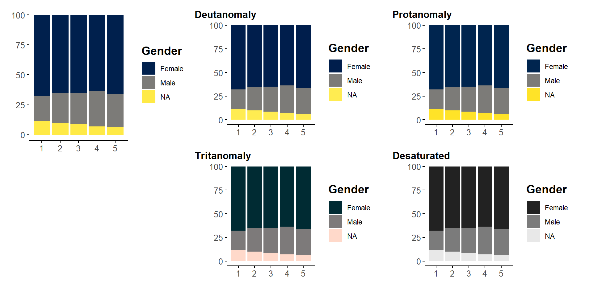
Rainbows are always bad choices
because they are not perceptually uniform
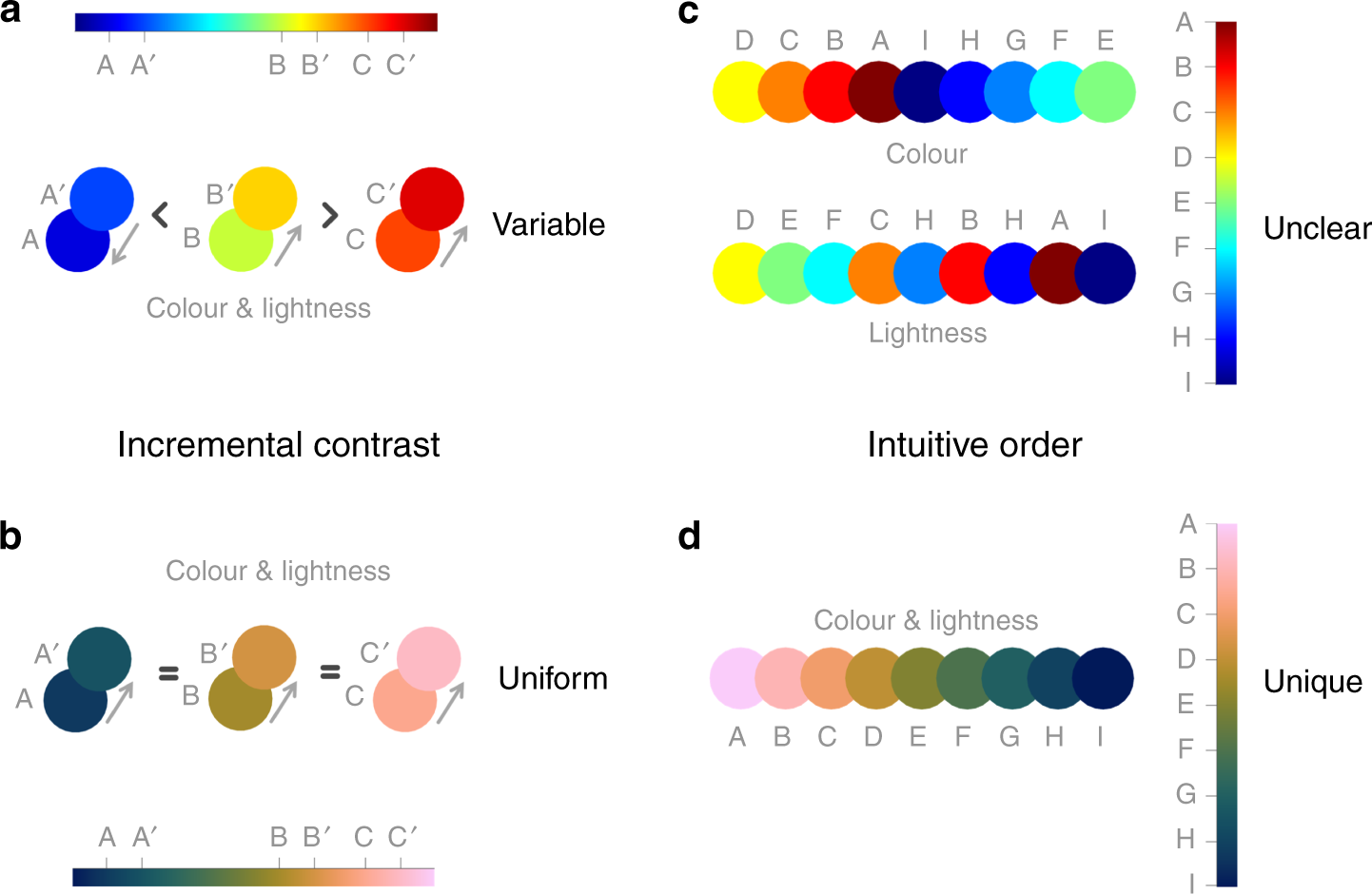
Use transparency
- Useful for density, background
- Retain color information without overwhelming figure
Average 32 y.o. French person
only experienced 1 white Christmas

A deceptive cultural construction

A deceptive cultural construction
Snow is not associated with Christmas
before the 13th century

St. Albans Psalter, 12th century, WIKIMEDIA
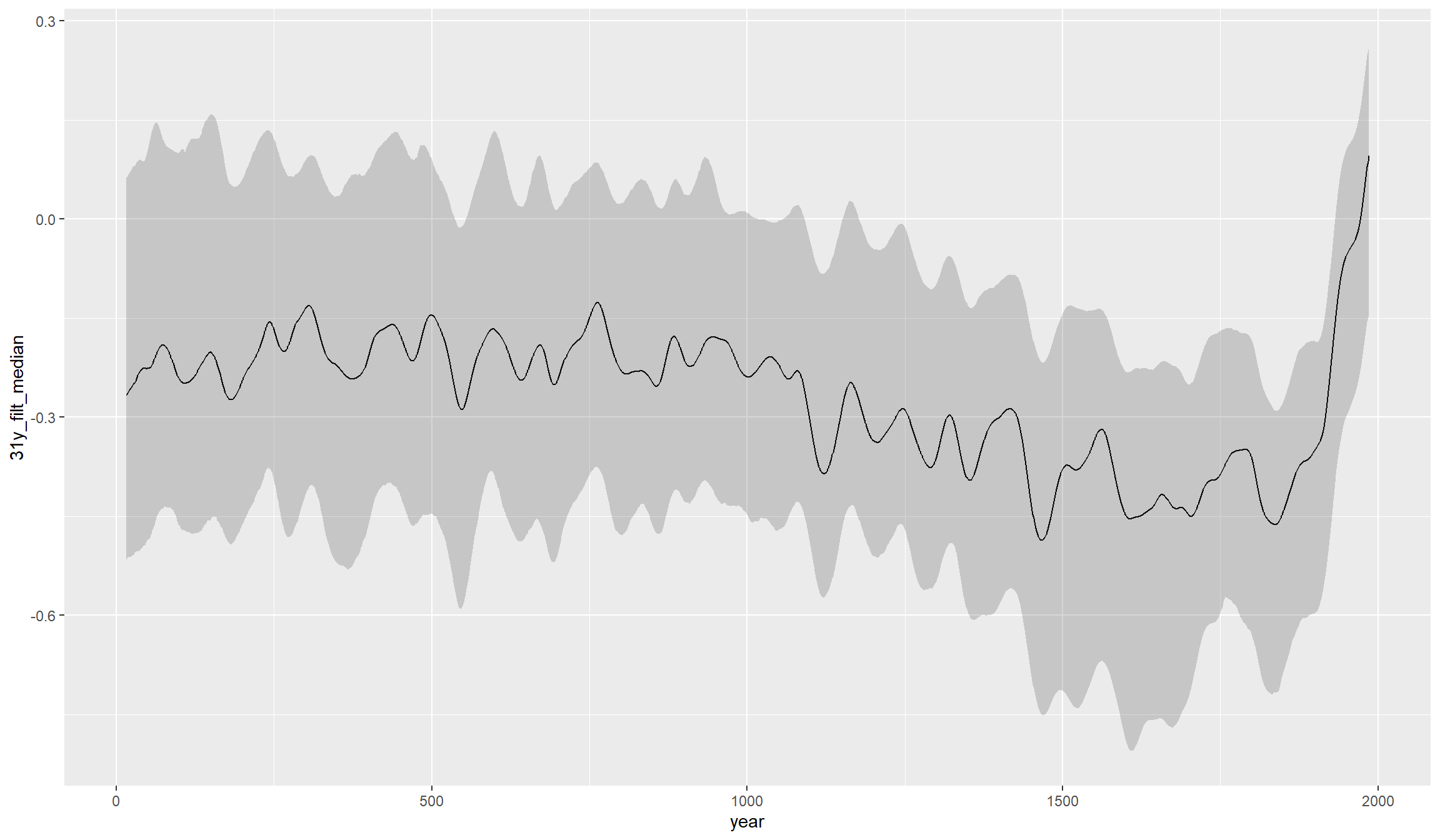
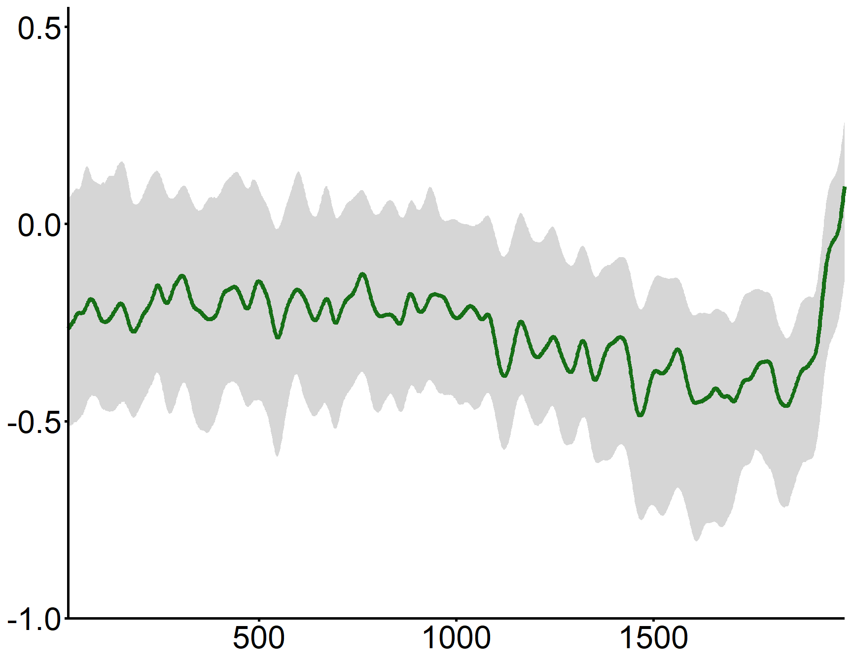
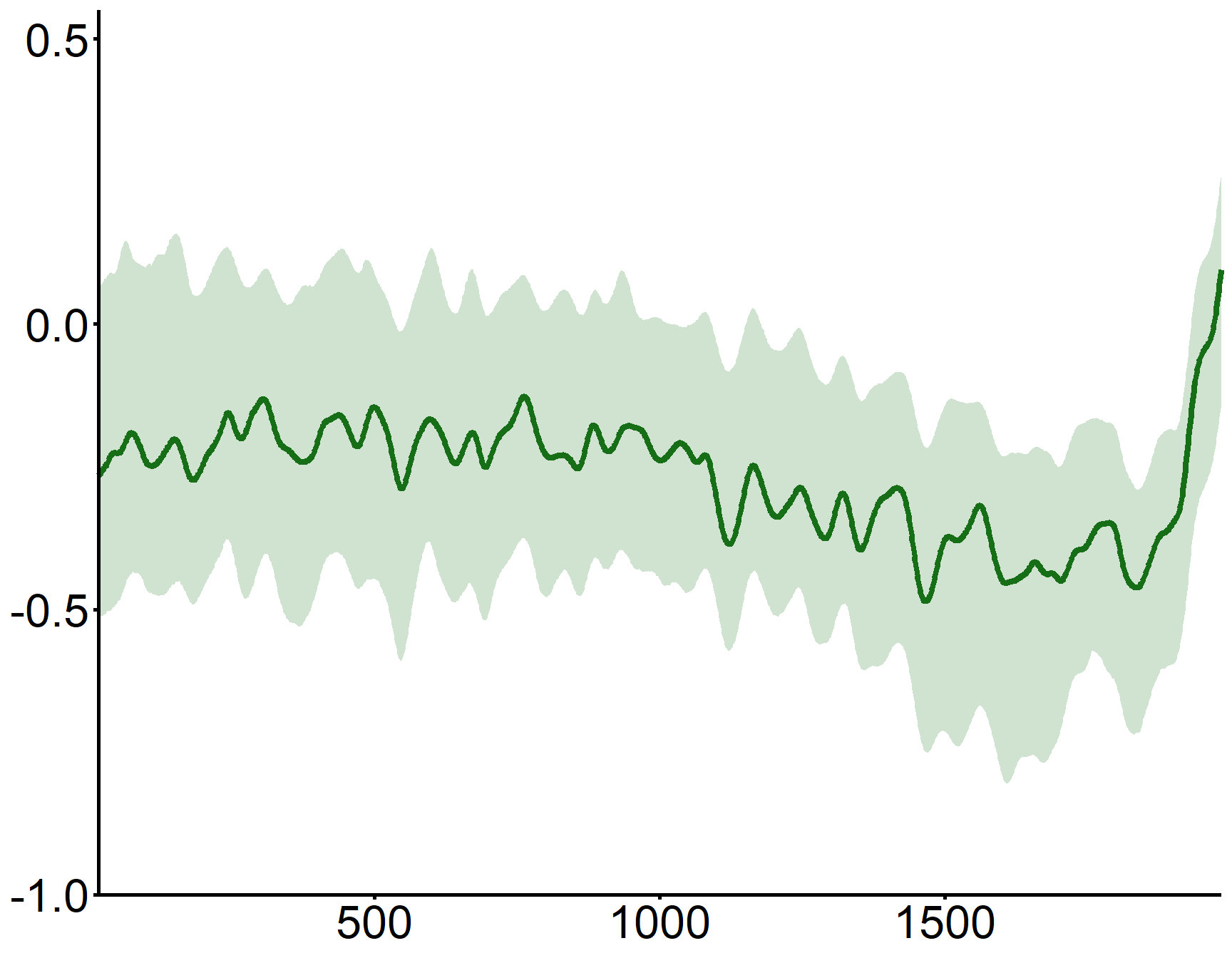
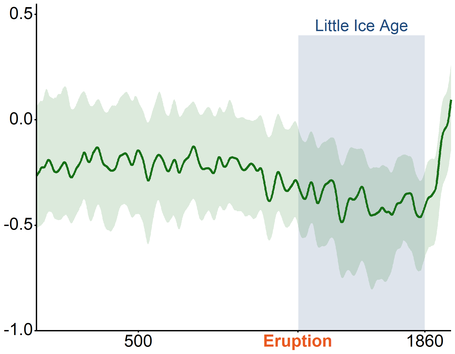
A volcanic eruption triggered an ice age in Europe
Remove unnecessary elements and add whitespace
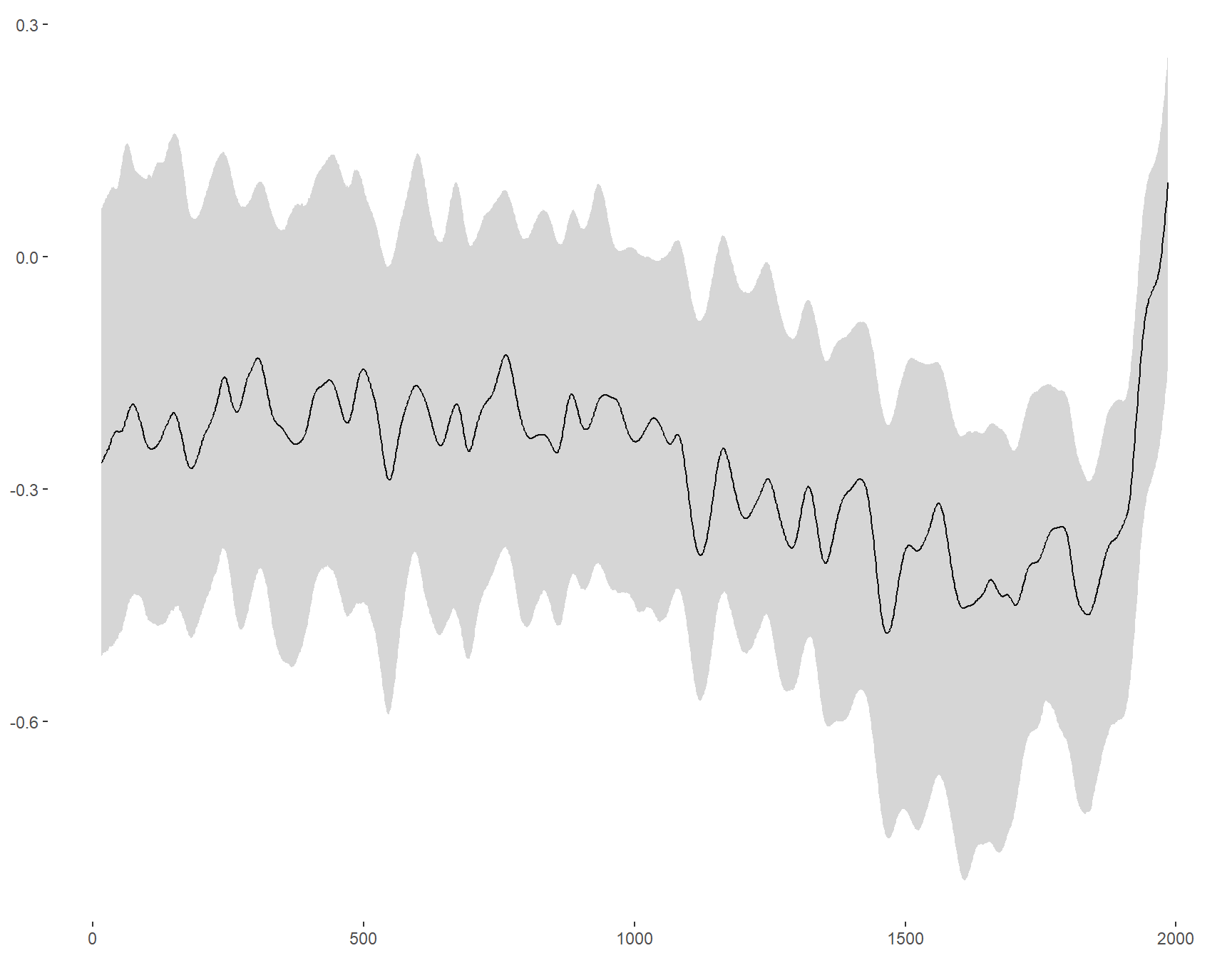
Add clean axes and labels
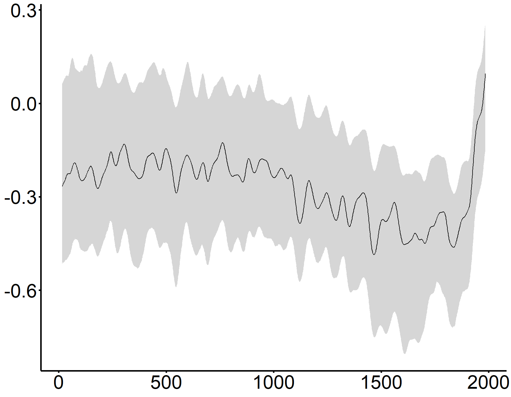
Rescale to maximise signal
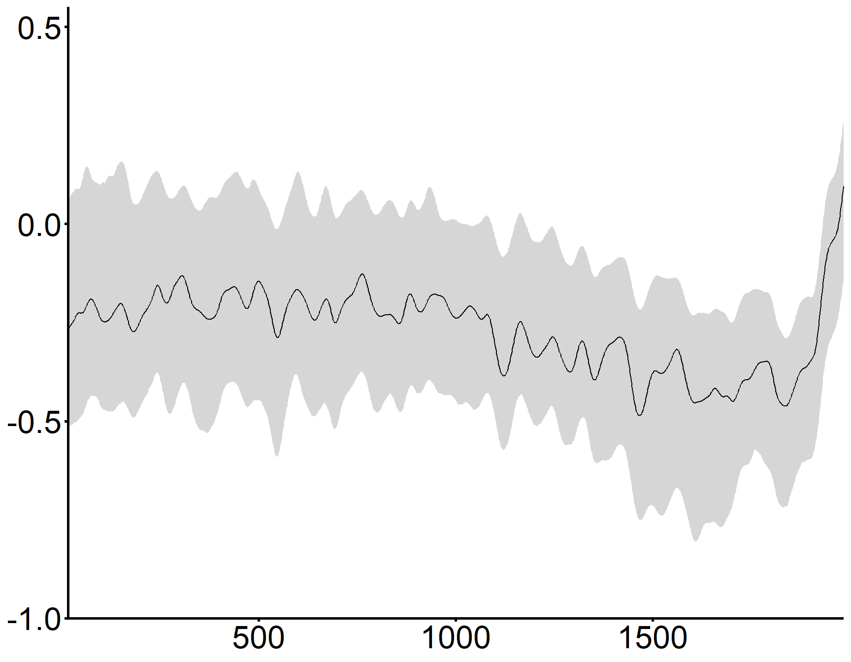
Increase legibility
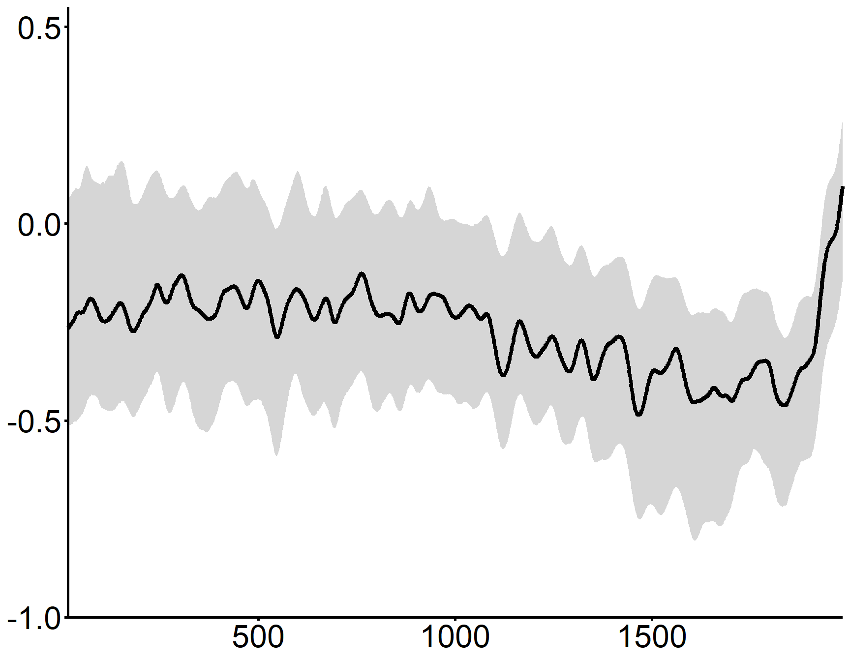
Ensure consistency with slide theme
Use shading to limit the number of colors
Annotate to highlight key information
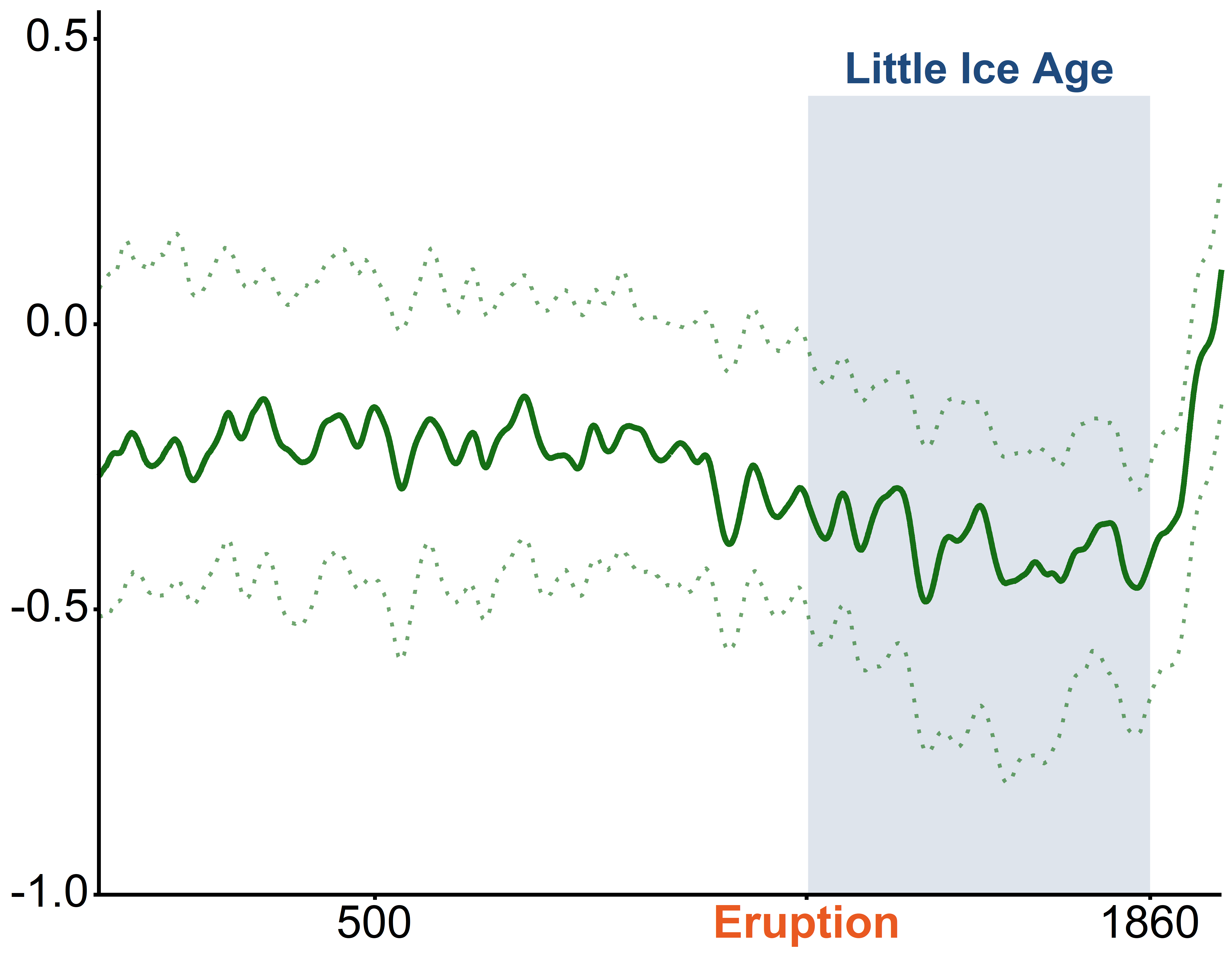
Clean up the plot again if necessary

Increase resolution

Source data

R. Neukom, 2019, 10.6084/m9.figshare.8143094
A volcanic eruption triggered an ice age in Europe
R. Neukom, 2019, 10.6084/m9.figshare.8143094
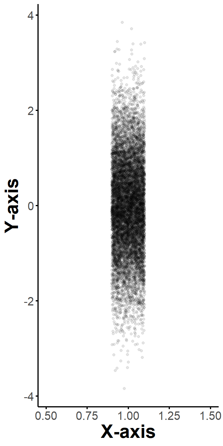
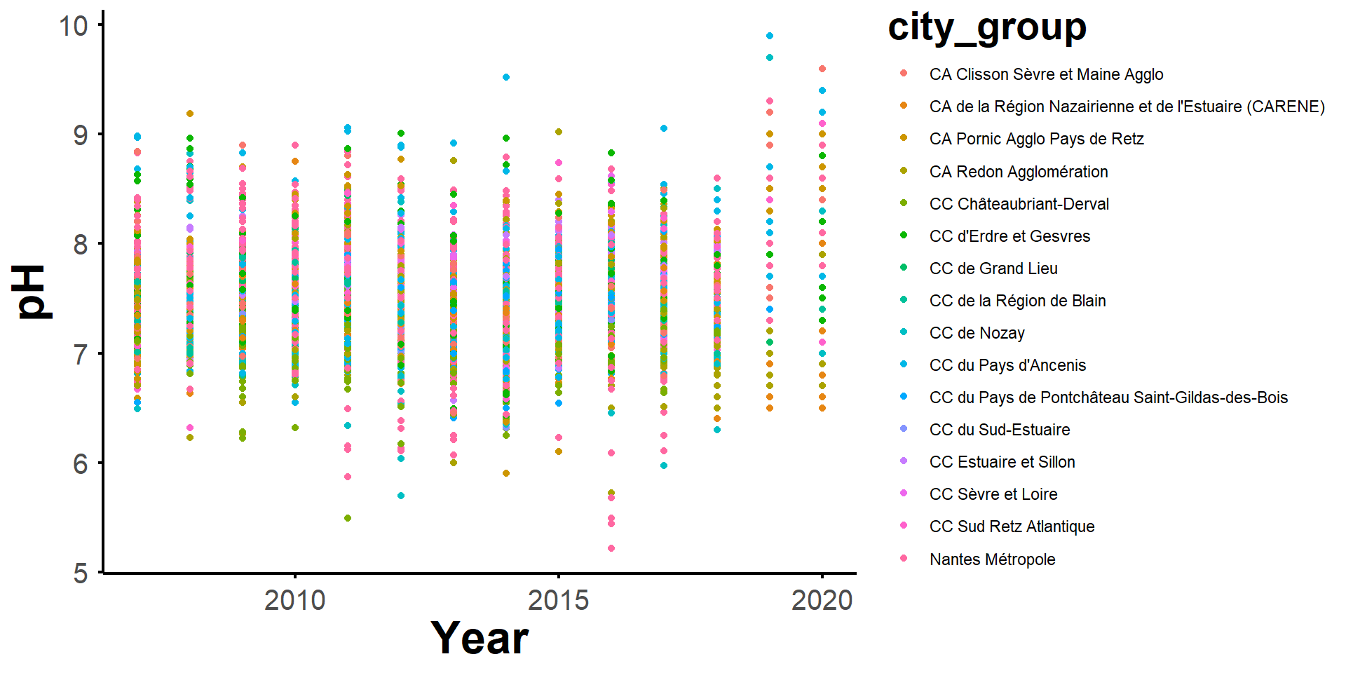
The base figure is a mess
Adding transparency and trends is not incrediby useful
Faceting per city group clean things up
but it is still hard to see the trends
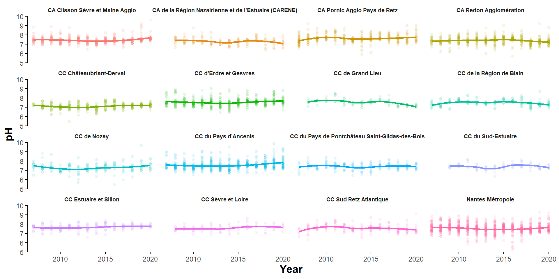
Recoloring to better see trends is a fail
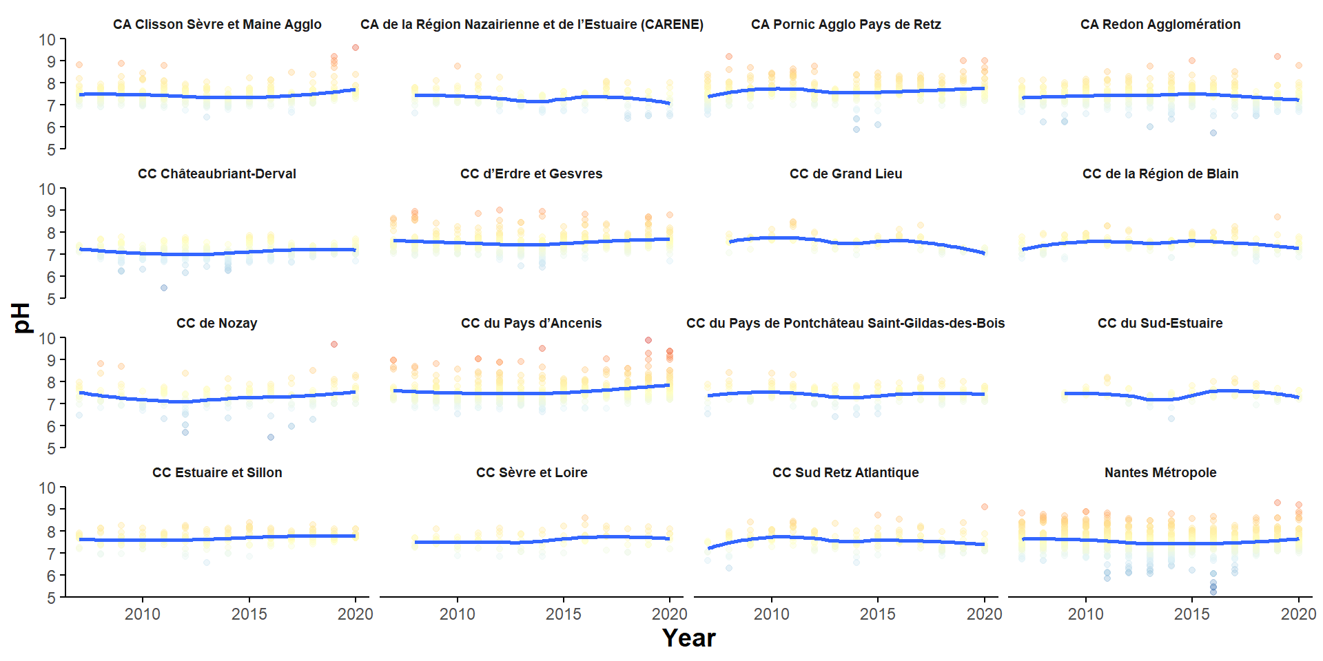
Statistical summaries may be a better approach
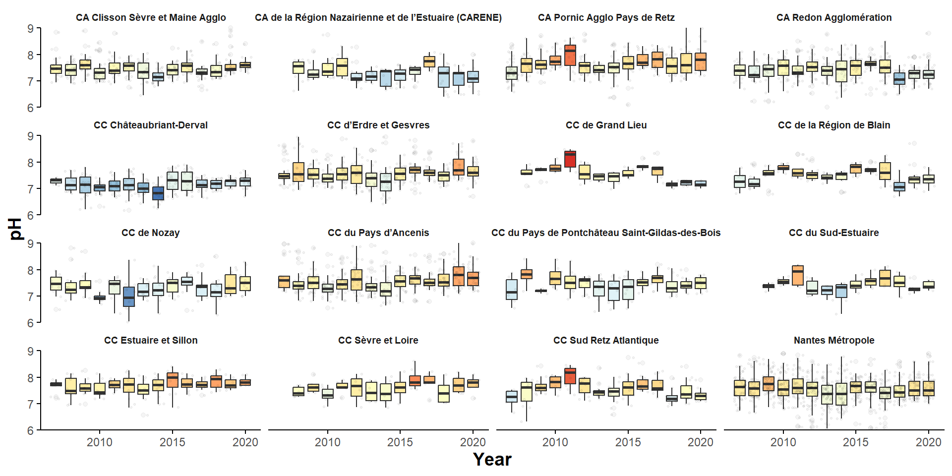
Simplification through highlighting solves the issue
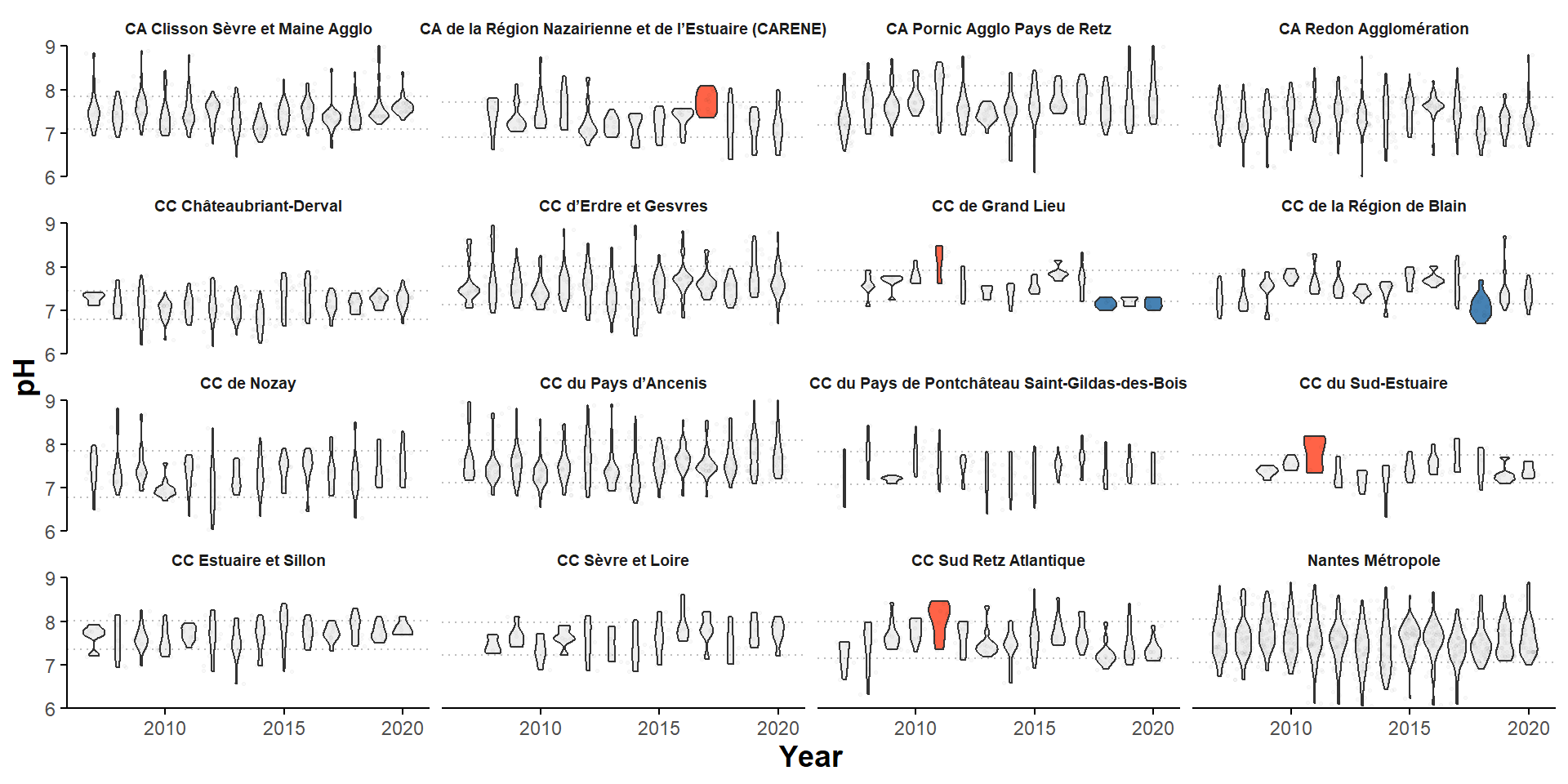
Get the message across, simplify more!
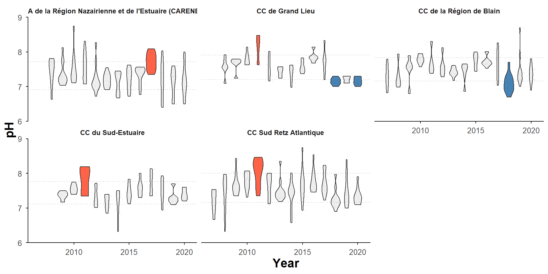
Colored violins are @ ± 1 SD from the mean
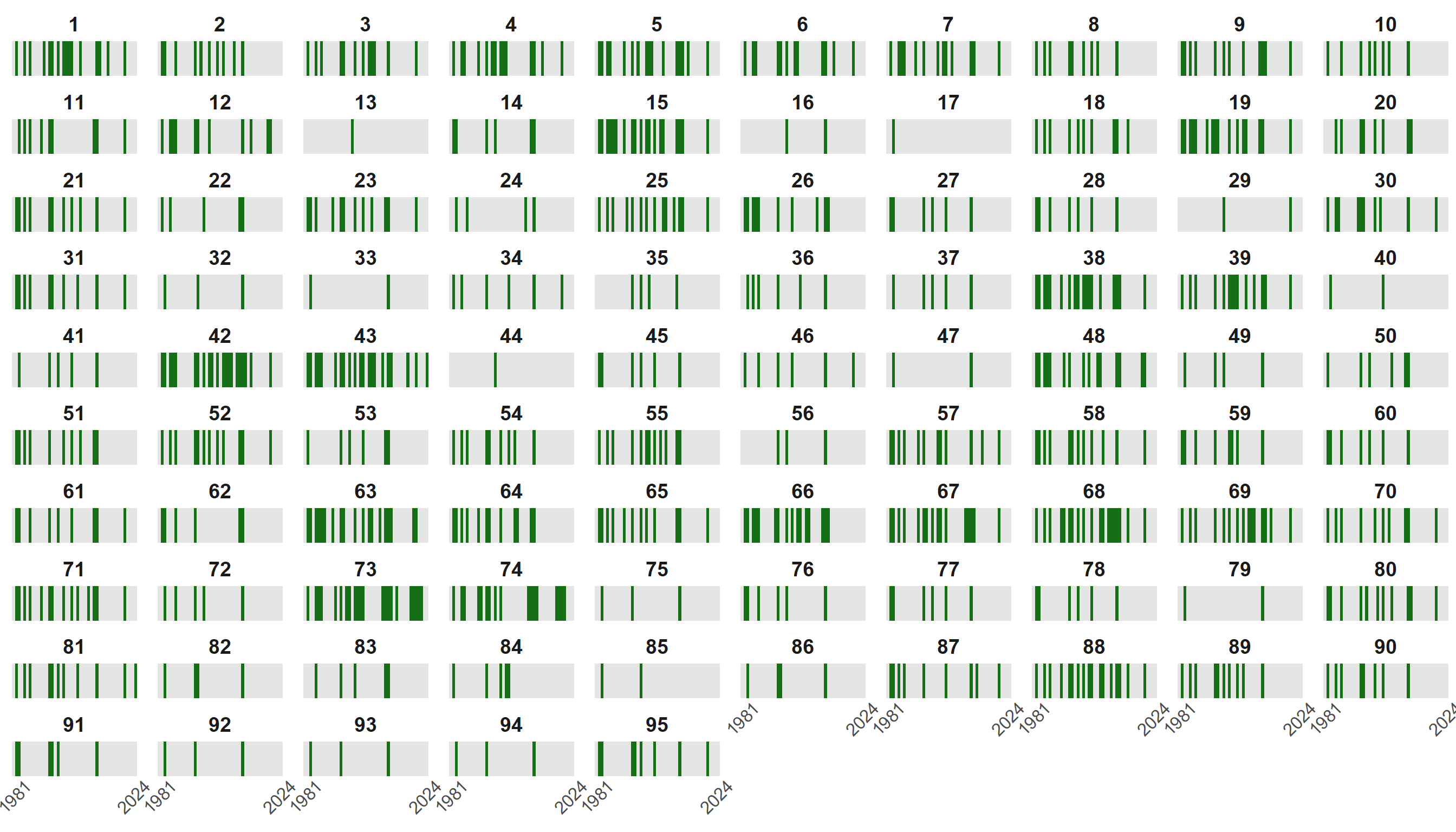
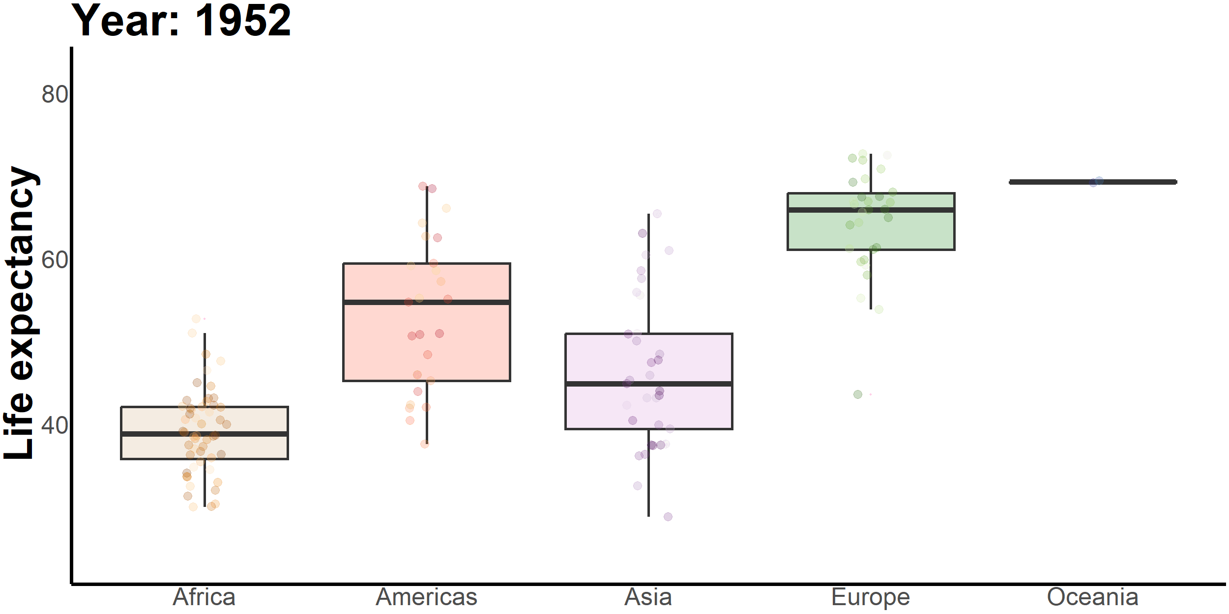
Figures are not legible when there are too many series
even with direct labelling
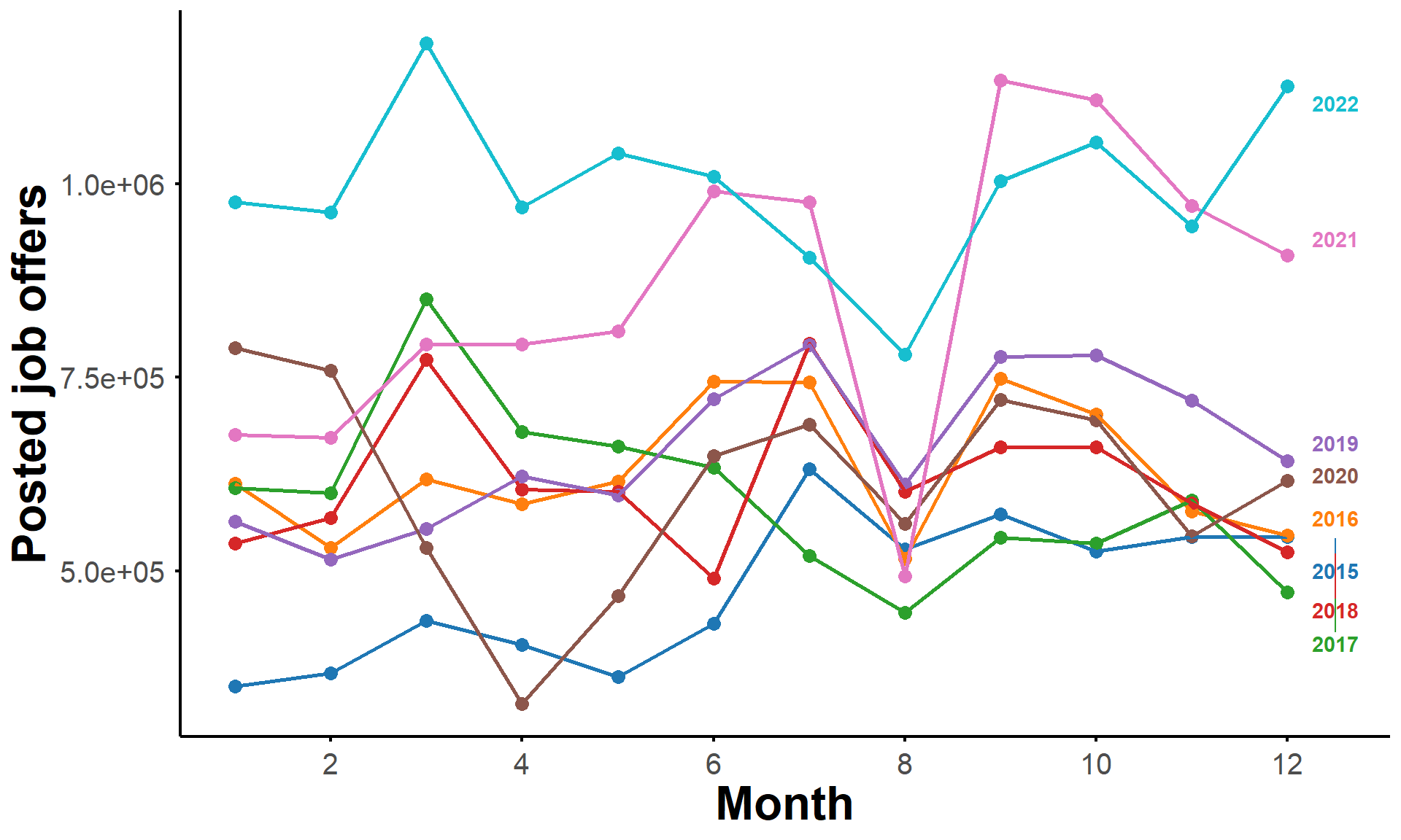
Number of job offers posted by Pôle Emploi since 2015
A simple animation with highlighting
is very effective to convey the message
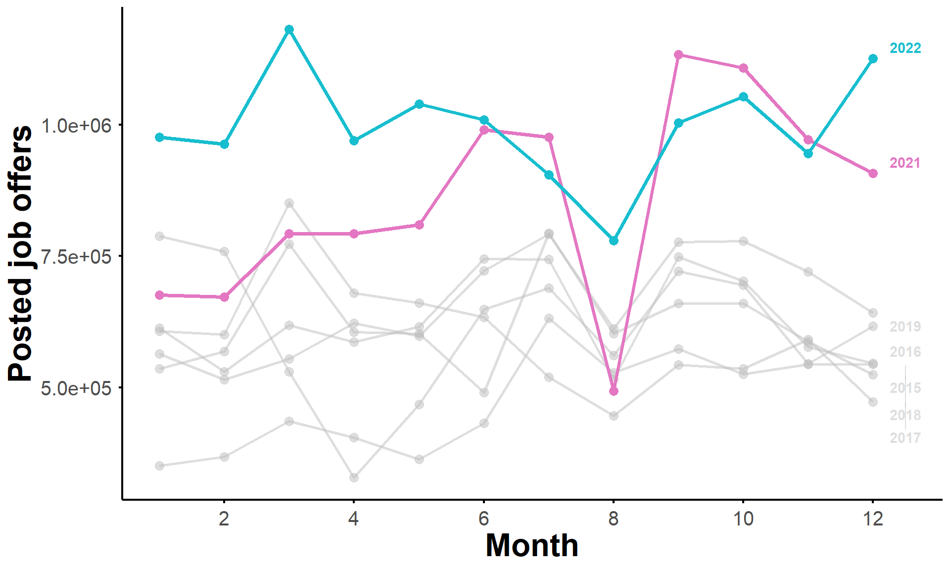
The number of job offers posted by Pôle Emploi has increased the past two years
That looks fancy
Does it convey a message or just noise?
They did it because they could
not because they should